
End of 2016, marked a milestone in search engine optimization through Google’s mobile-first index. There is nothing shocking about it as Google has been clearing its intention to prioritize mobile optimization from time to time. As compared to 2015, 2016 witnessed a huge shift towards searching through mobile devices. In other words, an era of mobile devices has arrived.
However, the majority of sites are still getting developed for desktop first and then later, they are calibrated for mobile devices. Regardless of the approach, sites are shifting their way towards mobile friendly user experiences. Some might still believe in mobile responsiveness, or some might choose to go mobile-first. Mobile is always there in the picture. In this article, I am going to look into how Google has shifted its way towards mobiles and how it wants you to go mobile friendly now.
Google wants you to… –
After going through different stats, I have picked out some highlights that illustrate the importance of mobile in the upcoming year.
Numbers of people searching on mobile devices are comparatively more than those who search on desktops. As a result, if your site is not mobile-friendly, one out of every five visitors will leave your site. Even for the mobile devices, if your site takes more than 3 seconds to load, people will abandon your site.
It is so because more people are searching on their mobile devices, and these devices are generating traffic for your website. In case if any searcher finds your pages too good to load on a mobile or takes more than expected time (generally 3 seconds), he will never visit your site, at least on mobile device after that. Thus, delimiting your website traffic to desktop devices only which is not a good thing your SEO and website ranking at all.
Time to adapt to mobile first index-
The philosophy of mobile-first index is based on the stat that search engines receive more queries from mobile devices by the end of 2016. Soon, it is expected to increase so much that desktop searches would become less important. There are two factors which determine the effectiveness of your approach to go mobile first- Speed of loading on mobile devices and user experience.
Both the above-specified factors work hand in hand with each other. A website with faster loading pages will not be said as mobile pages until the pages can adjust themselves with mobile screens and vice-versa.
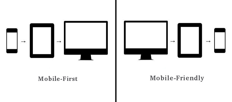
Considering this, mobile sites are needed to be developed first and then they are calibrated for the desktop versions. This approach is exactly the opposite of what we were doing from the past before mobile first index hit the floor. If you want to get listed in the top searches in Google’s SERP, mobile first is the latest way to impress it.
If not mobile-first, mobile friendly in the next big thing-

Going Mobile friendly is the next best approach to impress Google in 2017. This can be done using three approaches, that are being followed till date.
1. Responsive web design- Making your website pages respond to the different devices based on the screen sizes.
2. Dynamic content – Serving contents based on the platform used to request the page.
3. Separate URLs- different URLs for each version of the webpage- mobile and desktop version.
While Dynamic and Separate URLs are less popular approaches due to their complexity and cost of implementation, responsive web design is the most popular approach here. Responsive web design has been here in the market for a while as is still expected to rule. Even Google has made clear that responsive web designs can work parallel to the mobile first index. Those who have the responsive designs already need not switch to the mobile first design.
These are the two approaches which Google wants you to follow in 2017. Some essential considerations like speed load speed and user experience are included in both the approaches. You have to give special care in providing best user experience without hurting the page load speed. There are some other approaches which are still in dilemma like the AMPs. It is because Google says they will scroll the desktop pages if they have to choose from AMP and desktop versions of the pages. Whatever be the cause, it is clear that Google wants you to now think mobile and design for mobiles.