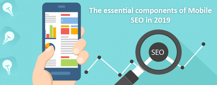
The shift to mobile dominated browsing started long ago, and Google has been on stressing mobile optimization from time to time. It’s a time when most of the website owners have understood the importance of going mobile with their site. However, there is still some confusion among most of them regarding what actually a perfect mobile optimization would be for Google?
Well making Google happy on the mobile front is quite easy here. Just get a good mobile responsive theme or template for your website and that’s it, it’s mobile responsive now.
But, it’s not just about making Google happy with your business website but to also make your users must feel good about it. If your users are not getting the proper mobile experience, it’s more likely to be possible that Google won’t like it either. So, with SEO, UX is also damn important. In this post, I am going to enlist some mobile SEO and UX practices that can help you get a perfectly SEO and UX friendly website.
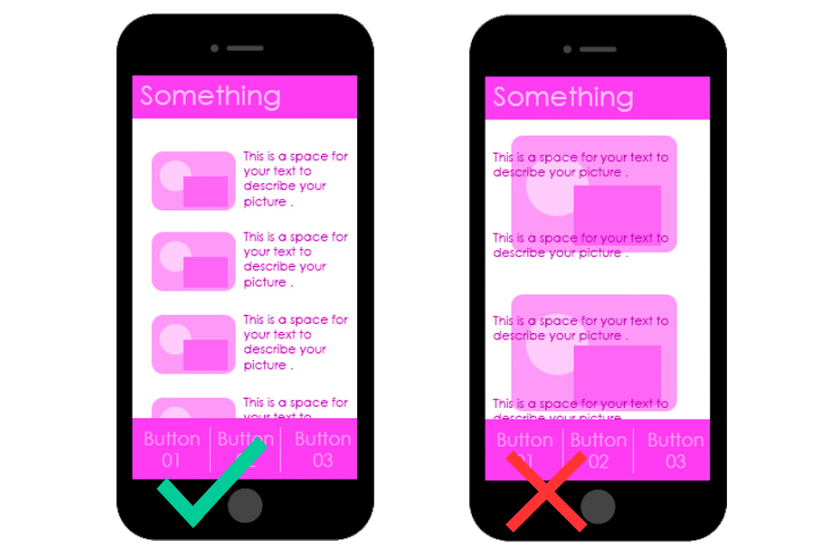
1. First thing is the buttons
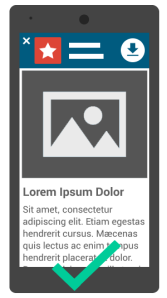
CTA buttons are the most important part of a page on your website. If optimized properly, they can bring revenue to your business. Having a poorly optimized button can not only result in poor user experience but also bad SEO impacts.
- Make sure the buttons do not overlap with each other; you don’t want your users to get irritated by clicking on “Add to Cart” button while they actually intend to click on “Add to Wishlist” button.
- Keep proper white spaces between the different elements and sections on the page.
2. Proper redirection if you use separate URLs
If you use the separate URL mode of mobile optimization (separate mobile and desktop sites) then you need to make sure you redirect the correct users to correct URLs.
Some websites redirect mobile users to the mobile homepage, regardless of which URL they originally requested. Moreover, there are some sites which redirect the Android user to mobile site but windows phone and iPhone users to the desktop site or vice versa.
These practices are completely wrong. You must follow these tips while using the redirects:
- Redirect a mobile user to a mobile site and desktop user to the desktop site. Set up your server to redirect mobile users to the equivalent mobile URL only.
- Redirect a mobile user to the corresponding mobile URLs only; not on the homepage. You can use Google Search Console to detect that any of your site’s pages are redirecting phone users to the homepage.
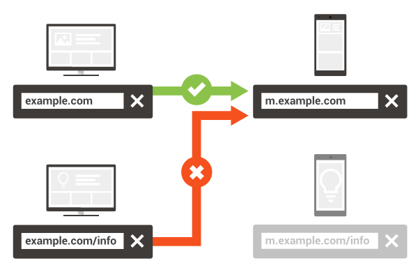
- Use proper identification of the mobile devices and direct users from all mobile platforms to the mobile site only; not just for Android but for windows phone and iPhone as well.
- If you don’t have a mobile URL for a page, then redirect the users to the corresponding desktop URL only; not on some error page.

- Try to get a responsive site rather than a separate mobile site. Responsive sites are more easy to achieve and they do not create all these redirect issues. You can give your customers the equally good mobile experience without having a separate mobile URL.
3. Avoid disruptive interstitials and pop-ups
Interstitials are basically the extra content that shows ups over a page in the form of the Ad banner, bar, or a pop-up. While optimizing for mobile, you must pay a special care about the usage of such interstitials on your mobile pages. Google has an SEO penalty scheme for using interstitials irresponsibly. The best practices of using the interstitials are as follows:
- Make sure the interstitials do not overlap the main content on the page.
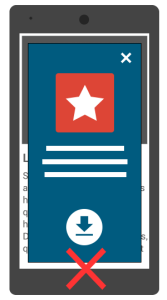
- The interstitials that you use should allow the user to browse and interact with the main content on the page.
NOTE
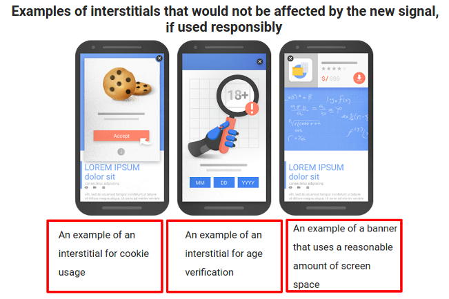
Not all the interstitials are bad here. Google also gives the Examples of interstitials that would not be penalized, if used carefully
In Google’s words:
“Interstitials that appear to be in response to a legal obligation, such as for cookie usage or for age verification.”
“Login dialogs on sites where content is not publicly indexable, such as private content like email or unindexable content that is behind a pay wall.”
“Banners that use a reasonable amount of screen space and are easily dismissible. For example, the app install banners provided by Safari and Chrome are examples of banners that use a reasonable amount of screen space.”
4. Use social sharing
Users on the mobile phone are more active on social media than on the desktop devices. Social sharing button, being shown on the mobile sites, give better response rate than the same button on the desktop version of the site. So, using the social buttons on your mobile site can give you a widespread social extension.
Users on mobile generally are already logged into their social media account. In this case, when you ask for a social sharing, they can perform it easily with a single click. Unlike the desktop conditions when users prefer to log out of the social account once done browsing it. In this situation, they refrain from the social sharing on the desktop as they will have to log in again.
That’s where the social buttons on mobile devices come out as more effective with better returns. By adding the social buttons on your site, you can make it known among the users who rarely use the desktop version of their social media account.
5. Optimize loading speed on mobile
It very important that your mobile site loads quickly. The patience span of users on mobile is quite short. According to various studies, about 45% of users will not wait for more than 2 seconds to load your page. If it takes more than 2 seconds, you will start losing the visitors percent by percent as the each second passes. For every one second delay, you will lose 7% of your visitors.
You can use the Google’s Page Speed Insights or Test My Site Tool to check your desktop and mobile loading speeds respectively. In fact, Google has recently updated its Test My Site tool, and now it gives deeper insights in addition to the page speed checking.
There are various recommendations from Google and other website development experts for optimizing the page load speed. Use their tips and do whatever you should do to make your pages load as faster as possible.
There are even some back-office optimizations that can help in improving the page loading.
Over to you
These are some mobile optimization aspects that determine the UX and SEO of your mobile site. To get better ranking on the mobile SEPRs, you must have a better mobile site with better user experience. Improve your UX, SEO will automatically improve. Hopefully, these tips will help you make your site responsive to not only the search engines but also the actual users.