In today’s era of technological advancement, the field of competition makes eCommerce design extremely important. Mobile responsive designs have now become a necessity for designing eCommerce websites online. Now-a-day’s most of the people are using iPhones and tablets to purchase online, however it doesn’t means that they are abandoning their laptops and desktop.
During the past few years, the concept of designing mobile responsive design was much appreciated because of the competitive advantage, but now it’s been the hard requirement to get ahead of competition. Since competition among eCommerce companies has really heated up over the last few years, let’s look at 4 different eCommerce design trends that are going to be significant for the coming year:
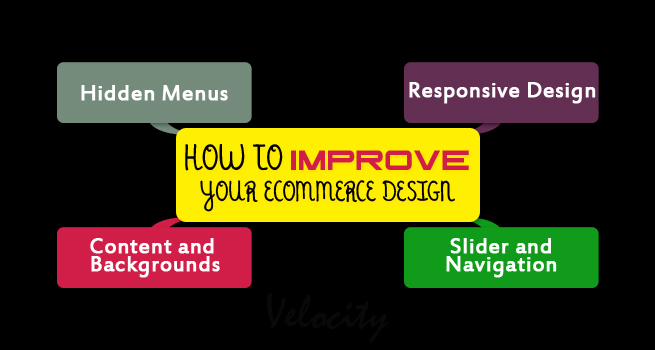
Hidden Menus
Responsive menus play a vital role in giving high-end user experience. Placed in a manner to reduce unnecessary scrolling, the menus save space and line up the pages. For better usability, menu buttons are placed on top of responsive websites or kept hidden to save space. Position of the menu thus streamlines navigation and caters unbeatable user experience. Hidden menus are becoming popular as anyone can find them nearly on all Google sites.
While designing mobile responsive websites, Hidden menus have become equally important and popular. Sometimes unnecessary navigation may cause hindrance to shoppers while they are engaged on some other useful work than browsing. So, there is a need to add “Hamburger” or “Hidden” menus while designing eCommerce websites.
Large Screen Responsive Design
Designing a website that is convenient for mobile users is not enough to bring ever lasting customers for your website. Think about smart televisions and large desktop! As per the report given by Econsultancy’s director of product development, Chris Lake, 20% of the website traffic comes from visitors who use device with 1920 pixel wide screen.
Less Slider and Larger Navigation Elements
Because online retailers want to ensure that visitors can use any device, web designers are making a conscious effort to alter or remove elements that may not work as well on small screen. The two best examples of this design trend are sliders and navigation elements. With the former many designers are choosing to remove sliders as a result of them not working all that great on phones and tablets. And with the latter, a lot of designers are opting to increase the size of those elements so they are easier to click.
Video Content and Backgrounds
eCommerce experts and online business entrepreneurs have been attempting to utilize the advantages of video to sell products online. Content marketing ideas like promotional videos helps to attract customers, thereby allowing them to make ‘n’ number of purchases from your site.
Using videos on product detail pages along with the description adds attractive and more functionality to your eCommerce website. You can use these videos even on blogs, You Tube and sometimes images can be posted on your website’s home pages to let customers get aware about your services in a more specified way.
The above 3 features presents an innovative approach to eCommerce web designing in 2015. Utilizing at least a few of them are likely to provide a competitive advantage. If you feel that your eCommerce business needs to do something to ensure that you stay ahead of the competition, you won’t regret to utilize any of these design trends.