
According to the Worldwide Quarterly Mobile Phone Tracker data of third quarter Q3 of 2015 by IDC (International Data Corporation), the number of mobile shipments around the world was 355.2 million which was around 6.8% higher than the same quarter of previous 2014 year. With such a widespread sale of mobile phones, the pressure of providing the effective access to numerous sites on mobile devices has also increased tremendously on various website development services. Although, the mobile hardware and software has upgraded to a much decent level but still there are various limiting factors that hamper the effective loading of the sites on various mobile based devices.
Earlier, the online businesses were unable to provide mobile customers an easy access to their sites due to the use of images, graphics and other such elements that took a lot of time to load on particular mobile devices whose hardware and software specifications were comparatively lower than that of a desktop or laptop. But, thank to the constant innovation and efforts of the various mobile developers and designers, mobile sites can now load up much faster without taking a considerable amount of time due to the presence of AMP HTML (Accelerated Mobile Pages HTML) mobile framework. But, before knowing more about this new technology, let us first understand why online businesses are making a fast transition into the world of mobile phones.
Importance of Mobile sites for businesses
Here are the reasons that support this mass transition of websites from desktop platforms to mobile platforms.
1. Mobile sites provide customers information based on their location and specific time zones so that they can access the particular offers and discounts that are applicable to their particular place.
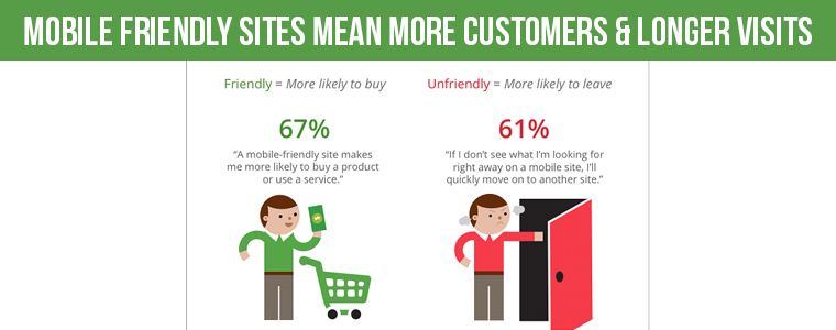
2. As per the 2014 study data by Shopify platform, around 50.3% of all traffic coming onto eCommerce sites are driven by the mobile based devices whereas the remaning 49.7% are driven by the computers. So, it becomes necessary to adopt this fast emerging platform for grabbing maximum share in terms of conversion rates and sales revenue.
3. Mobile sites provide better user experience to customers and don’t require users to be present at a particular location which happens in the case of desktops. It provides more mobility freedom to access and use a particular website.
4. Mobiles are increasingly used everywhere and thus your business needs to be prepared for making the most of this fast growing business platform. Further, a mobile site can be easily developed due to the easy availability of mobile web development platforms like HTML5, CSS, JavaScript, mobile responsive design and other such facilities.
5. Consumer behavior is changing rapidly which makes it mandatory to switch over to this new platform. Moreover, due to the increasing use of mobile devices, it provides the increased opportunity to online businesses for better customer acquisition.

6. Mobile devices are affecting the SEO activity to a great extent as a large number of online searching is driven by the mobile based devices. Further, Google’s test for mobile friendliness and Hummingbird algorithm has forced online businesses to pay attention to their mobile sites for better online rankings and to avoid search engine penalties.
Earlier initial improvements by Google in website loading time and performance
Understanding the growing impact and influence of the mobile devices on the online businesses of the world, Google began the crucial task of mobile site optimization. It started focusing on the mobile site loading time, image loading, content optimization, URL and content indexing , mobile search, site maps and other such aspects that aim to affect the performance of your mobile website to a great extent. The efforts towards making the website more mobile friendly began in the year 2009 itself but the first mobile website speed testing tool was launched in the year 2011.
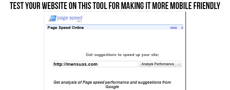
On March 31, 2011, Google Labs introduced the web based tool known as Page Speed Online for improving the loading time and performance of mobile website. Some of the brilliant features provided by this mobile optimization tool are elimination of uncacheable landing page redirects, reduction in the JavaScript parsing and availability of page speed suggestions. A significant amount of strategy revolving around the mobile site optimization began in the period of 2012 to the present date. Now, the focus is entirely given on quality signals for image search landing pages, availability of relevant site links, easy detection of 404 status codes, location specific searching facility, use of rich snippets, autocomplete option, spam detection feature in image searching, accurate byline dates, improved dataset for related queries, faster mobile browsing and other such features.
Google Algorithms that changed the face of mobile websites
Google, a pioneering name in the field of search engine has revolutionized the SEO from time to time through its numerous search algorithms. The significant contributions of the Google algorithms in the field of mobile site optimization are as follows:
Hummingbird Algorithm-

Introduced in the late 2013, Hummingbird algorithm changed the complete face of the SEO industry as it was an all- together new algorithm unlike the previous algorithms of Panda and Penguin. It provided the emphasis back on the semantic of the content rather than the irrelevant keyword stuffing. Apart from this, it also played a significant role in the optimization of sites for mobile devices. Now, with this algorithm, the searching on mobile devices have changed to a great extent by building and improving their knowledge graph. The mobile searching is now evolving tremendously from short keyword driven inquiries to the advanced language processing where users can ask questions normally like people do ask in the real life.
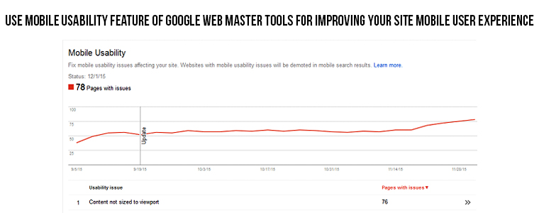
New Google Mobile Friendly update- The red carpet for this algorithm was rolled way back in November, 2014 when Google introduced the Mobile Usability component in its Google Webmaster Tools. This feature provided site owners a clear insight about whether their particular websites were mobile friendly or not. With this mobile testing feature, Google emphasized on the need to make websites more mobile friendly for better online rankings.

Finally, Google launched the latest update regarding mobile sites on 21st April, 2015 that is going to penalize the non mobile friendly sites heavily and affect their online rankings to a great extent. It is considered as the most significant algorithm than the previous Panda or Penguin updates. This is because it can affect a greater percentage of queries that were affected by the Panda (12% queries) or Penguin (3%). In order to avoid your website from getting penalized by search engines, you need to test your website on this particular link for better online rankings in terms of mobile friendliness. All you have to do is just enter the URL of your website on the space provided. It will run some quick tests that will provide you clear idea about whether your website is mobile friendly or not. Based on those results, you can easily understand what are the possible loop holes in your website that is affecting your mobile search rankings.
Apart from this, there are various tools like Mobile Usability feature on the Google Webmaster Tools, Google Analytics, Mobile friendly testing sites like 6S Testing, PageSpeed Insights from Google Developers tool and other such that can help in making your websites more mobile friendly and to improve your website rankings in terms of mobile friendliness. Further, the introduction of the Accelerated Mobile Pages HTML (AMP HTML) is being touted as the next big thing in the mobile world after the development of the open source mobile operating system, Android for mobile devices. Let us take a look and understand why it has grabbed the fancy and imagination of every web site owners and developers around the world.
Arrrival of Google Accelerated Mobile Pages HTML (AMP HTML)
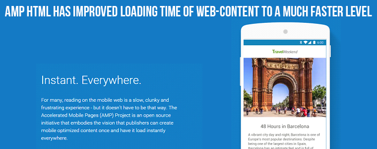
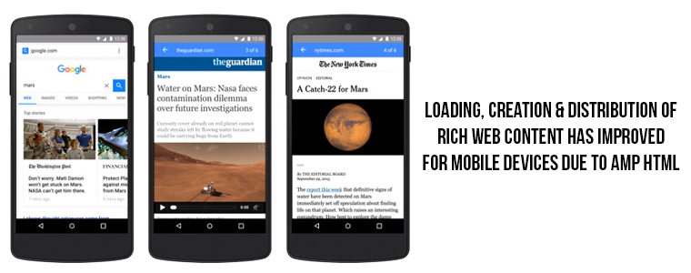
Facebook users may be aware about the Facebook Instant Articles that helps Facebook content to load faster on Facebook’s local environment than the time it may take to load on standard mobile browser. Taking a cue from the Facebook, Google started its own open framework known as Accelerated Mobile Pages (AMP) project to facilitate faster loading of the web pages on various mobile devices. This AMP HTML is basically a subset of HTML that consists of only specific JavaScript components. It is designed for the creation of mobile friendly readable content that comprises of rich content like video, animations and graphics alongside the smart ads that can be loaded at a faster rate. This framework has revolutionized the mobile user experience of various sites as the same code will work seamlessly on multiple mobile devices irrespective of their hardware and software specifications.
With AMP HTML, you can now easily create light- weight pages for your website that can load much faster on any mobile device. Some of the earlier organizations that collaborated on this new platform are Pinterest, Chartbeat, WordPress.com, Parse.ly, LinkedIn and Adobe Analytics. Till now, around 30 publishers from all around the world have joined together with this project to provide a seamless access to their sites on multiple mobile devices. Some of the various areas which are targeted by this AMP HTML open framework are as follows:
1. Content-
Due to increased focus and attention of the content publishers on various rich content like image carousels, maps, videos, social plug-ins and data visualization elements for grabbing instant attention of their targeted customers, AMP HTML has given much priority to the rich web content. Moreover, it also helped them to implement ads and analytics for increasing money minting appeal of their content and for getting a clear insight about the likes and dislikes of your customers. With the help of this AMP project, it has now become easier for content publishers to create rich, visually appealing content without compromising on the shared features of your content for better user experience and site performance.
2. Page loading speed- A delay of even few seconds can hurt the business fortunes of online businesses drastically as mobile users are impatient. Considering this critical situation, AMP has made it possible to load mobile pages in an instant of time. Further, it has been seen that an AMP HTML page can load around 80- 90% faster than a standard mobile page based on the speed of your network connections and mobile processing speed. This is due to the fact that an AMP- HTML page is six times lighter in coding and consists of around 5 times less trackers than a normal mobile web page.
3. Effective distribution of the web content- This AMP HTML project has made the sharing of web content much simplified and faster across multiple mobile devices. Now, a content published in a particular geographical location can be accessed and load fastly in an instant. All this has become possible because of the free availability of the Google caching servers. So, web content can be effortlessly published and distributed all across the world without any usual delay that used to occur earlier in the case of standard mobile web pages.
4. Helps in improving the monetization value of the published content- In case of free web service providers, it is important to have ads in the content so as to generate the required revenue for the day- to- day functioning of the service provider company. With the introduction of this Accelerated Mobile Pages HTML (AMP HTML), a wide range of ad formats, ad networks and technologies are easily supported now. All the existing ad networks and ad formats used by the sites can be effectively utilized on this open mobile framework. The technology was developed with the aim of supporting paywalls and subscriptions on the web content. Further, work is being done along with the publishers to achieve a breakthrough speed in the loading time of the web content on various mobile devices.
Impact of Google AMP HTML mobile framework on web world

This open source project from Google known as Accelerated Mobile Pages(AMP) has brought a tremendous change in the mobile industry and has made the loading up of the news publications articles and other such rich web content much faster on various smart phones and tablets. Although, the project has not been officially introduced by the Google yet but still it has received around 250 contributions in the coding field on platforms like Github and more than 4500 web developers from around the world have been in constant touch with this open mobile framework project. Some of the well known media houses that have supported the Google in this global initiative are News Corp, Washington Post, BBC, CBS Interactive, New York Times, International Business Times/Newsweek, Sankei, Thrillist, Slate and many others.
Apart from this, various ad networks like AOL, DoubleClick, OpenX, AdSense and Outbrain have partnered with Google to become a part of this global open mobile framework. Due to faster caching servers of Google, web pages on AMP framework will load up much faster on various mobile based devices and thus improves the web experience of mobile users to a great extent. Presently, Facebook’s Instant Articles and Apple News are doing the same job like the AMP framework but their use and access is limited to their particular service users, whereas Google AMP HTML project is aimed for a much wider global mobile audience.
A sneak peek into the open AMP HTML mobile framework
Necessary guidelines for a AMP HTML document
Some of the things that needs to be taken care of while creating the AMP HTML document is described below:
– Every AMP HTML page should begin with the <!doctype html> tag.
– The document should have a top- level <html ⚡> tag. The equivalent <html amp> tag is also accepted in the document.
– Inclusion of <head> and <body> are mandatory in AMP HTML coding which are optional in case of HTML coding.
– A relational canonical tag <link rel=”canonical” href=”$SOME_URL” /> should be present in the head tag for indicating the regular HTML version of the AMP HTML document or to itself in case of the absence of an HTML version.
– The AMP HTML code should contain a <meta charset=”utf-8″> tag as the first child of the head tag.
– The coding should have this <meta name=”viewport” content=”width=device-width,minimum-scale=1″> tag within their head tag. It is further advised to include initial-scale=1 in your coding part.
– Include this <script async src=”https://cdn.ampproject.org/v0.js”></script> tag in the last part of your head tag statements.
– It is important to include this <style>body {opacity: 0}</style><noscript><style> body {opacity: 1}</style></noscript> statement in your head tag.
Development of a simple AMP HTML page
Being a subset of HTML, the global web programming language, the coding in AMP HTML is not some rocket science. Programmers can effortlessly create a simple AMP HTML page by following this code.
<!doctype html>
<html amp lang=”en”>
<head>
<meta charset=”utf-8″>
<title>Hello, AMPs</title>
<link rel=”canonical” href=”http://example.ampproject.org/article-metadata.html” />
<meta name=”viewport” content=”width=device-width,minimum-scale=1,initial-scale=1″>
<script type=”application/ld+json”>
{
“@context”: “http://schema.org”,
“@type”: “NewsArticle”,
“headline”: “Open-source framework for publishing content”,
“datePublished”: “2015-10-07T12:02:41Z”,
“image”: [
“logo.jpg”
]
}
</script>
<style>body {opacity: 0}</style><noscript><style>body {opacity: 1}</style></noscript>
<script async src=”https://cdn.ampproject.org/v0.js”></script>
</head>
<body>
<h1>Welcome to the mobile web</h1>
</body>
</html>
Code to add an image in the AMP HTML document
As, AMP HTML project is basically designed to create rich content and its seamless distribution on multiple mobile devices, so required images can be easily added to your basic AMP HTML page. Here is the sample code that can help you in this crucial task.
<!doctype html>
<html amp lang=”en”>
<head>
<meta charset=”utf-8″>
<title>Hello, AMPs</title>
<link rel=”canonical” href=”http://example.ampproject.org/article-metadata.html” />
<meta name=”viewport” content=”width=device-width,minimum-scale=1,initial-scale=1″>
<script type=”application/ld+json”>
{
“@context”: “http://schema.org”,
“@type”: “NewsArticle”,
“headline”: “Open-source framework for publishing content everywhere”,
“datePublished”: “2015-10-07T12:02:41Z”,
“image”: [
“logo.jpg”
]
}
</script>
<style>body {opacity: 0}</style><noscript><style>body {opacity: 1}</style></noscript>
<script async src=”https://cdn.ampproject.org/v0.js”></script>
</head>
<body>
<h1>Welcome to the mobile web</h1>
<amp-img src=”welcome.jpg” alt=”Welcome” height=”2000″ width=”800″></amp-img>
</body>
</html>
If you are not just satisfied with the simple image in your content, this open mobile framework gives you freedom to do more. Web developers can now effortlessly add various media elements like animated images, videos, social media content like tweet, ads, audio files and other such features. To get a fair idea about how to do the same, you need to follow this useful link in order to add more rich web based content, https://github.com/ampproject/amphtml/blob/master/docs/include_features.md.
Application of style elements in the AMP HTML page
For further, providing a new and improved look to your basic AMP HTML page, you can also include exciting style elements. Here is how you can add custom CSS style elements in your simple AMP web pages.
<!doctype html>
<html amp lang=”en”>
<head>
<meta charset=”utf-8″>
<title>Hello, AMPs</title>
<link rel=”canonical” href=”http://example.ampproject.org/article-metadata.html” />
<meta name=”viewport” content=”width=device-width,minimum-scale=1,initial-scale=1″>
<script type=”application/ld+json”>
{
“@context”: “http://schema.org”,
“@type”: “NewsArticle”,
“headline”: “Open-source framework for publishing content everywhere”,
“datePublished”: “2015-10-07T12:02:41Z”,
“image”: [
“logo.jpg”
]
}
</script>
<style>body {opacity: 0}</style><noscript><style>body {opacity: 1}</style></noscript>
<style amp-custom>
/* any custom style goes here; and remember, body margin can not be declared */
body {
background-color: white;
}
amp-img {
background-color: gray;
}
</style>
<script async src=”https://cdn.ampproject.org/v0.js”></script>
</head>
<body>
<h1>Welcome to the mobile web</h1>
<amp-img src=”welcome.jpg” alt=”Welcome” height=”2000″ width=”800″></amp-img>
</body>
</html>
Page layout options in AMP HTML framework
For facilitating the faster loading of the AMP pages on various smart phones and tablets, all the externally loaded resources like image, ads, videos, audio and other elements should contain a fixed height and width attributes. Due to this, it is easier for the browser to calculate the sizes of all elements through CSS automatically and there would be no recalculation of the element sizes due to the presence of various external resources. Further, it does not allow style attributes to be used for the tags as it affects the loading time of the AMP pages to a great extent. If you want a more detailed information about the use of style elements in the AMP HTML framework, here is the useful link that will provide you complete information about the page layout features- https://github.com/ampproject/amphtml/blob/master/spec/amp-html-components.md.
Introduction of Chrome Developer Tools for AMP HTML testing

Chrome Developer Tools (DevTools) is a web based built- in tool that is provided by Google Chrome browser. With the help of this developer tools, you can easily create, test and debug your web pages for their effective performance on multiple computing devices. Take a tour of this wonderful tool for getting a fair idea about the setting up of this editor, use of various DevTools, mode of interaction with the tool through command line statements and other such tasks. Follow this wonderful link, https://developers.google.com/web/tools/setup/ that will guide you in the following areas:
– Setting up of the editor for the creation of web pages.
– Establishing Persistence through DevTools Workspaces.
– Introduction of CSS and JS Preprocessors into your DevTools editor.
– Establishment of Command line shortcuts.
– Setting up of the browser extensions for the tool.
– Establishment of web page development tools.
How to finally test your AMP HTML page?
Once, you have successful created the AMP HTML web page, it is time to finally get it tested for ensuring its effective working across multiple mobile devices. First, you need to view the page in your local server and then validate the page by utilizing the services of Chrome DevTools console. For people who have no idea about the Chrome DevTools, this page link https://developers.google.com/web/tools/chrome-devtools/debug/console/ will prove to be a treasure hunt for the real time web interaction process during AMP page testing. Here is a step- by- step process that can guide you effectively in the task of AMP HTML web page testing.
1. To begin with, you need to add your AMP HTML page in your local directory, say for example, /ampproject/amphtml/examples.
2. Start your web server and run your project locally. For optimizing the performance of your web server, you need to run this code- python -m SimpleHTTPServer.
3. Now, you need to open your AMP page by visiting this link, http://localhost:8000/released.amp.html.
4. After this, you need to add “#development=1” to the URL, say for example, http://localhost:8000/released.amp.html#development=1.
5. Finally, you need to open the Chrome DevTools console for the effective checking of all validation errors.
Till now, you have got every useful information about Accelerated Mobile Pages HTML (AMP HTML) that can help you in optimizing mobile user experience of your website for its targeted audience. If you are still not enthusiastic about this emerging mobile web development technology, you can be best described as your “own worst enemy only”. So, start encouraging your web developers to learn, understand and began developing web pages on this new mobile framework that can ensure a faster and seamless web content loading and distribution on multiple mobile devices around the world.